
A really solid page builder with mobile responsiveness is the Elementor 2.2. In itself includes awesome UX and UI configurations. One side of the Elementor makes faster your site. The other side optimized for compatibility, worth and speed. No lingering shortcodes accelerate marketing and boost up sales.
One of its achievement is to take place in Github. We have mentioned some editing strategies of Elementor 2.2 before. It’s time to elaborate on another strategy that how Elementor generates a mobile responsive website. Give a trial with us.
Mobile Responsive Website
It is a common question what a mobile responsive website is. When a site is reactive, the layout and content adapt based on the size of the screen. As it about mobile responsive, the substances adjustments with the screen size of mobile, laptop and tab.
Why do concern about mobile responsive design?
- Without forcing, give the visitors a proper experience with your site.
- Improving the layout of the content as the present phones typically zoom out automatic.
- Viewing the site circumstances for updated information.
Elementor Strategy: Generate a Mobile Responsive Website
Introducing you with the method to create a mobile responsive website step by step. Follow the beyond.
Generate a mobile responsive website with Elementor.
Elementor’s mobile editing essentials are we discuss:
- Reverse columns
- Mobile font size
- Responsive column width
- Padding and margin
- Hide and show elements
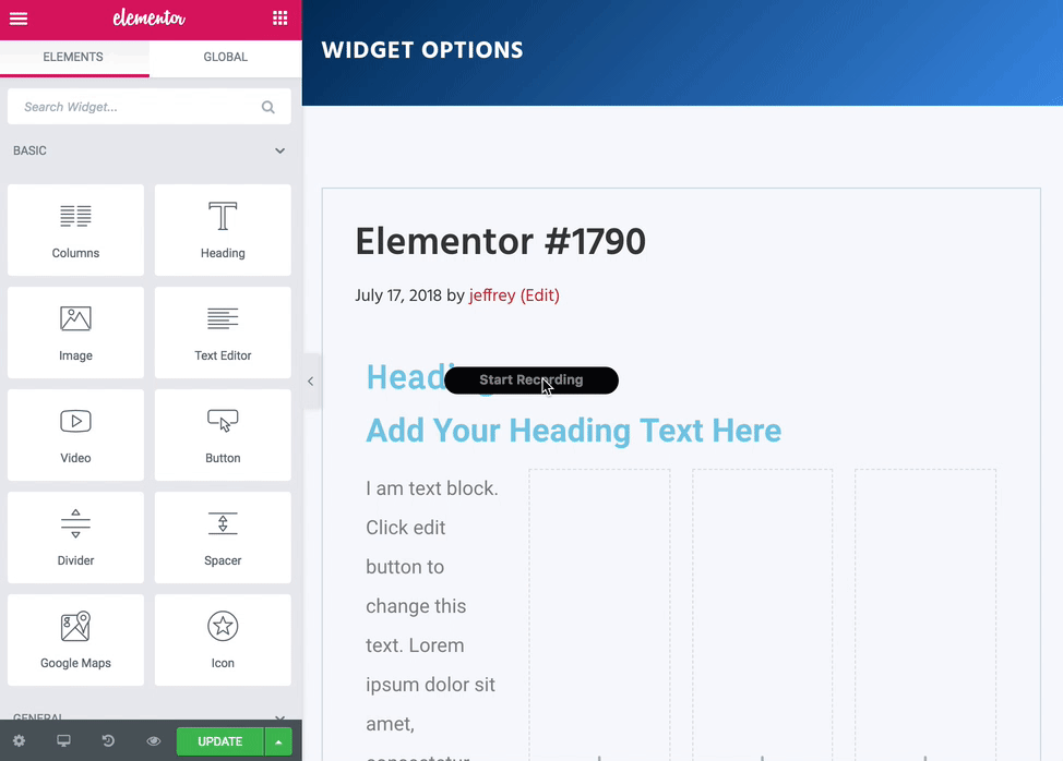
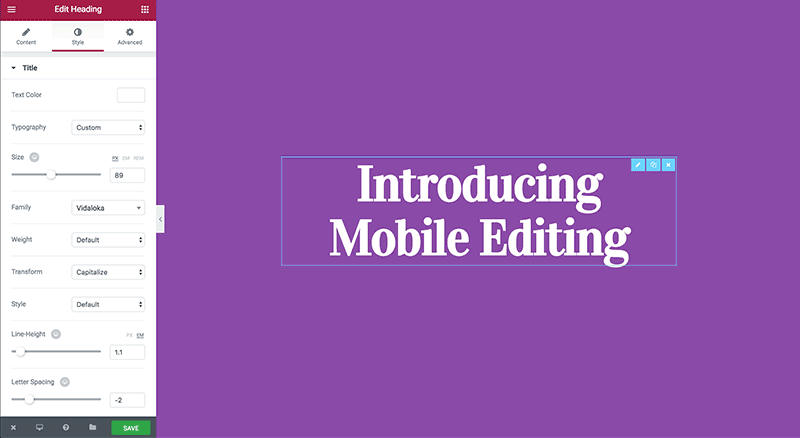
Press on the  icon that you must to alter for editing.
Change tablet and mobile breakpoints:
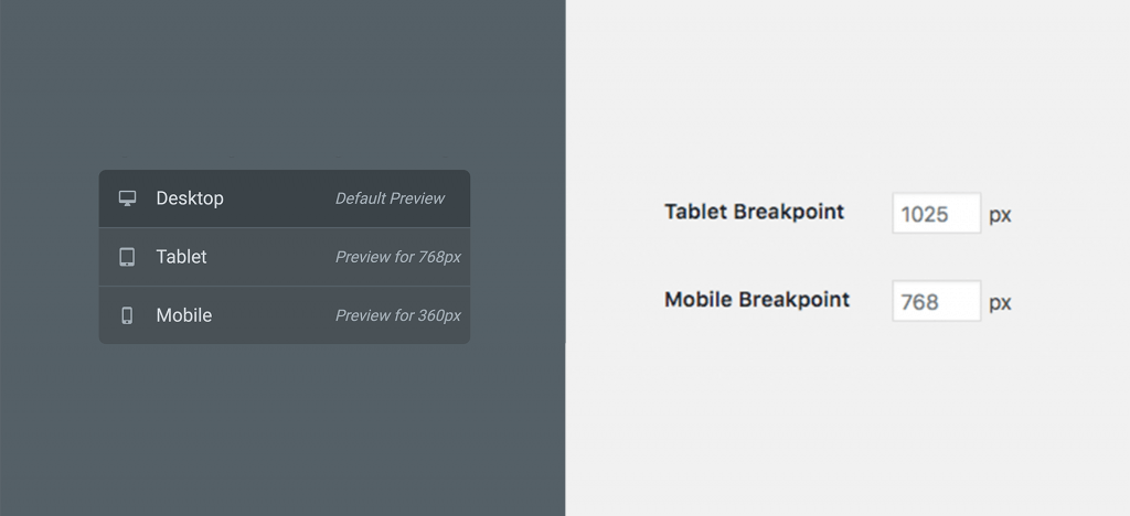
Set the tablet and mobile break-point values. But how?
- Move to Elementor > Settings > Style Tab.
- Save what have you changed.
- Click on Elementor > Tools > General Tab > Regenerate CSS Files.
Visibility:
As in Navigator Menu, we have mentioned how to hide or show a section. Again:
- Move to Section Setting > Advanced.
- Under Responsive > Visibility.
- Now set your visibility preferences.
Columns Ordering:
The user can reverse the organize columns in a page.
- Click on Section Setting > Advanced > Responsive.
- Now Reverse columns at ease.
- Set it to YES to save.
Device Preview:
- Dashboard > Give title > Edit with Elementor.
- Go to the left bottom.
- Switch between Mobile, Tablet and Desktop preview.
Sum It Up
The forthcoming of the web is what now? Of course, mobile responsive design. It is a revolution for all online publisher. Mobile responsive reduces the demand for expensive app development maintenance. Also, eliminates the necessity for several versions of the site. It is possible with the one website, many versions. Deliver the contexts what you want to show to audience automatically with a mobile responsive feature of Elementor.


